So, you’ve got a WooCommerce store humming along, products are flying off the virtual shelves, and customers are ready to buy. But wait, what about that checkout page? It’s often the last hurdle, and if it’s not smooth, people might just walk away. We’re talking about how to customize your WooCommerce checkout page to make sure those sales actually happen. It’s not as complicated as it sounds, and even small tweaks can make a big difference.
Key Takeaways
- Making your WooCommerce checkout page look better and work smoother can stop people from leaving before they buy.
- Plugins like FunnelKit Builder and SeedProd make it easier to change how your checkout page looks and what it does, even if you don’t know code.
- A simpler checkout process, with fewer fields and a clear layout, helps customers finish their orders faster.
- Adding things like customer reviews or security badges to your checkout page builds trust and reassures buyers.
- Checking how fast your checkout page loads and making sure it works well on phones is important for keeping customers happy and making sales.
Understanding The Importance Of Checkout Page Customization
Think about it: your customer has browsed your store, added items to their cart, and now they’re at the final step – the checkout. This is where the magic either happens or fizzles out. A clunky, confusing, or untrustworthy checkout page is a surefire way to lose a sale, even if the customer was ready to buy.
Reducing Cart Abandonment Rates
It’s a tough pill to swallow, but a significant number of shoppers bail out right at the checkout. We’re talking about potentially losing almost half of your sales in that final moment. Why? Often, it’s because the process is too long, too complicated, or just feels a bit off. Making the checkout process as smooth and clear as possible is key to keeping those customers from clicking away. This means cutting down on unnecessary steps and making sure all the information they need is right there.
Enhancing Customer Trust and Credibility
When a customer is about to hand over their payment details, trust is everything. If your checkout page looks basic, unprofessional, or lacks security signals, they might get cold feet. Adding elements like recognized payment logos, security badges, and even customer testimonials can make a huge difference. It reassures them that their information is safe and that they’re dealing with a legitimate business.
Boosting Average Order Value
Your checkout page isn’t just for collecting payment; it’s also a prime spot for a little extra salesmanship. Think about offering related products, gift wrapping services, or even an extended warranty right before they hit ‘purchase’. These additions can increase the total amount each customer spends without adding much friction to their buying journey. It’s a smart way to get a bit more revenue from customers who are already committed to buying.
Leveraging Plugins To Customise WooCommerce Checkout Page
So, you’ve got your WooCommerce store up and running, but the checkout page? It’s looking a bit… plain. And honestly, a plain checkout page can be a real turn-off for customers. That’s where plugins come in. They’re like the Swiss Army knife for your checkout, letting you tweak and tune until it’s just right. Using the right plugins can seriously cut down on abandoned carts and make your store look way more professional.
Utilizing FunnelKit Builder For Seamless Customization
If you’re looking for a way to make your checkout page look less like a generic form and more like a part of your brand, FunnelKit Builder is a solid choice. It lets you build custom checkout pages without needing to mess with code. Think of it as a drag-and-drop system for your checkout. You can pick from pre-made templates that are designed to convert, or build your own from scratch. It’s pretty neat because it can replace the standard WooCommerce checkout entirely, giving you a lot more control over the look and feel. Plus, it helps keep things transparent for your customers by showing order details and shipping costs right there. You can even add things like gift wrapping options or order bumps directly on the checkout page. It’s a good way to make the checkout process feel more personal and less like a chore for your customers. You can check out FunnelKit’s checkout templates to get an idea of what’s possible.
Employing SeedProd For Advanced Design Control
Now, if you’re someone who likes to have total control over every little pixel, SeedProd is worth a look. It’s a page builder, but it’s really good for creating custom checkout pages too. With SeedProd, you’re not just picking a template; you’re building the page from the ground up. This means you can match your checkout page perfectly to your website’s design, using your brand’s colors, fonts, and overall style. It’s great for adding custom elements, like special calls to action or unique product displays, right on the checkout page itself. If you want a truly unique checkout experience that stands out from the crowd, SeedProd gives you that power. It’s more about the design freedom here, letting you craft something that’s both functional and visually appealing.
Exploring Other Page Builder Options
Beyond FunnelKit and SeedProd, there are other page builders that can help you customize your WooCommerce checkout. Many popular WordPress page builders, like Elementor or Beaver Builder, have WooCommerce integrations or add-ons that allow you to design your checkout page visually. These often work by letting you create a template that overrides the default checkout. The advantage here is that if you’re already familiar with one of these builders, you can use that existing knowledge to customize your checkout. You might find you can add custom sections, change the layout of fields, or integrate other content blocks directly into the checkout flow. It’s all about finding the tool that fits your workflow and design needs best.
Streamlining The Checkout Process For Better Conversions
So, you’ve got people interested, they’ve added stuff to their cart, and now they’re heading to checkout. This is where a lot of online stores drop the ball. A clunky, confusing checkout page is like a brick wall between you and a sale. We need to make this part as smooth as possible.
Simplifying The Checkout Flow
Think about it: nobody wants to fill out a mile-long form. Every extra field is a potential reason for someone to leave. We’re talking about things like ‘Company Name’ or ‘Apartment Number’ that might not even be relevant for most of your customers. Get rid of anything that isn’t absolutely necessary. Also, consider breaking the checkout into distinct steps. Instead of one giant page, try a three-step process: customer information, shipping, and then payment. This makes it feel less overwhelming. Using something like AJAX for transitions between steps makes it feel quick and modern, which is a big plus.
Optimizing Checkout Field Layout
It’s not just about what fields you have, but how they look and where they are. For instance, putting the email field right at the top is smart. It lets you capture that information early, which is super useful for sending follow-up emails or recovering abandoned carts later. Tools that offer address autocomplete, like Google’s service, can save customers a ton of typing and reduce errors. Imagine someone typing their address wrong – that’s a recipe for lost packages and unhappy customers. Also, make sure your order summary is clear. People should be able to see what they’re buying, the price, and the total without squinting. Showing product images in the summary helps a lot.
Implementing One-Page Checkout Strategies
Sometimes, the best way to simplify is to put everything on one page. This is where a one-page checkout strategy comes in. Plugins can help you achieve this, allowing you to put all the checkout fields directly onto a product page or a dedicated landing page. This can be really effective for certain types of products or businesses. It cuts down on clicks and keeps the customer focused. However, it’s important to make sure this single page isn’t too cluttered. You still need clear sections for information, shipping, and payment, and a visible order total. It’s all about reducing friction and making that final purchase decision as easy as possible.
The default WooCommerce checkout often has too many fields, a confusing layout, and lacks modern conveniences. This leads to higher cart abandonment rates and lost sales. Streamlining this process is key to turning browsers into buyers.
Here’s a quick look at what makes a checkout flow better:
- Reduce Fields: Only ask for what’s absolutely necessary.
- Clear Steps: Break down the process into logical stages.
- Smart Layout: Place important fields like email upfront.
- Address Autofill: Use tools to speed up address entry.
- Visible Summary: Keep the order details clear and accessible.
Adding Value And Trust Signals To Your Checkout
Your checkout page is the final hurdle before a sale is made. Making it look trustworthy and adding a little something extra can really make a difference. It’s not just about taking payment; it’s about making the customer feel good about their purchase and confident in your brand.
Integrating Social Proof Elements
People like to know others are buying from you. Showing off positive reviews or testimonials right on the checkout page can be a big help. It’s like having friends whisper, "Yeah, this place is good!" in their ear.
- Display star ratings next to product names in the order summary.
- Show short, impactful customer quotes from happy buyers.
- Feature a running total of recent orders (e.g., "15 people bought this in the last hour!").
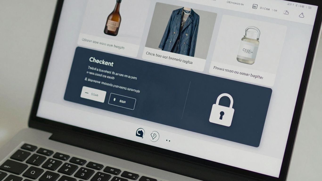
Displaying Trust Badges And Security Logos
This is super important. Customers are handing over their payment details, so they need to feel safe. Little logos can go a long way in showing you’re legit and secure.
- SSL Certificate Badge: Usually found near the payment section, this shows the connection is encrypted.
- Payment Method Logos: Displaying Visa, Mastercard, PayPal, etc., lets customers know you accept their preferred way to pay.
- Security Seals: Logos from services like Norton Secured or McAfee Secure add another layer of reassurance.
The visual cues of security and trust are often processed subconsciously. A customer might not consciously read every word, but they will notice the familiar logos and badges, which can immediately reduce anxiety about making a purchase.
Offering Additional Services Like Gift Wrapping
Sometimes, a small extra can turn a regular purchase into a special one. Offering things like gift wrapping or expedited shipping options right at checkout can add convenience and perceived value, potentially increasing the order total.
- Gift Wrapping Options: Allow customers to select gift wrapping for an additional fee.
- Personalized Gift Messages: Provide a field for customers to add a personal note.
- Express Shipping Tiers: Clearly list faster shipping options and their costs.
Technical Approaches To Customise WooCommerce Checkout Page
Sometimes, the easiest way to get things done isn’t always the most flexible. When plugins and page builders don’t quite cut it, or if you’re looking for a more hands-on approach, you can get into the code. This is where you can really fine-tune the checkout experience, but it does require a bit more technical know-how. Making changes directly with code offers the most granular control over your checkout process.
Modifying Checkout Styling With CSS
If your checkout page looks a bit bland or doesn’t quite match your brand’s aesthetic, CSS (Cascading Style Sheets) is your friend. You can inject custom CSS to change colors, fonts, spacing, and more. This is great for making the page look polished without altering its functionality. You can add your custom CSS in a few places:
- Appearance > Customize > Additional CSS: This is the safest and most recommended method for simple style tweaks. Your changes won’t be lost when the theme updates.
- Child Theme’s
style.cssfile: If you’re using a child theme (which you should be!), adding styles here is also a good practice. - Theme Options: Some themes offer a dedicated area for custom CSS.
For example, to change the color of the ‘Place Order’ button, you might use something like this:
.woocommerce-checkout .button[name="woocommerce_checkout_place_order"] {
    background-color: #ff6600;
    color: white;
}
This lets you adjust the look and feel to match your brand perfectly. It’s all about making that final step feel familiar and trustworthy for your customers.
Adjusting Checkout Logic With PHP Hooks
For more advanced customization, like changing the order of fields, adding conditional logic, or modifying how data is processed, you’ll need to work with PHP (Hypertext Preprocessor) and WooCommerce’s action and filter hooks. These hooks are like specific points in WooCommerce’s code where you can insert your own custom functions. It’s a powerful way to alter the checkout flow without directly editing the core WooCommerce files, which is a big no-no because your changes would disappear with every update.
Here are a few common scenarios where PHP hooks are useful:
- Adding custom fields: You can use hooks like
woocommerce_after_checkout_billing_formorwoocommerce_after_checkout_shipping_formto insert new fields. - Validating custom fields: Use
woocommerce_checkout_processto add custom validation rules for your new fields. - Modifying order details: Hooks like
woocommerce_checkout_create_orderallow you to change or add information to the order before it’s saved.
Remember, working with PHP requires careful attention. A single typo can break your entire checkout page. Always test changes on a staging site first and make sure you have a solid backup.
When you start modifying checkout logic with PHP, you’re essentially telling WooCommerce how to behave at specific moments. It’s like giving it new instructions. This is where you can get really creative, perhaps adding a field that only shows up if a certain product is in the cart, or automatically applying a discount based on a custom field entry. It’s a deep level of control that page builders often can’t replicate.
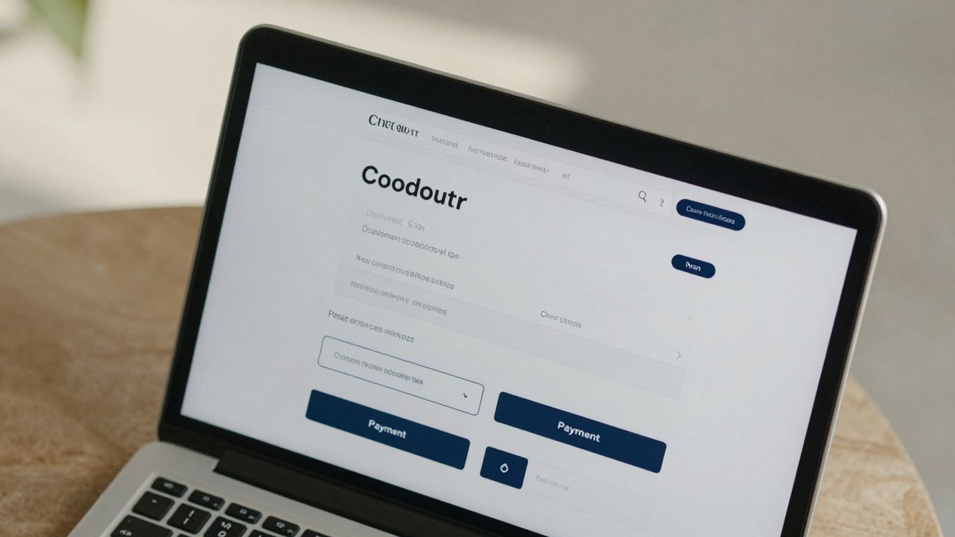
Understanding Shortcode Limitations
The [woocommerce_checkout] shortcode is what WooCommerce uses by default to display the checkout page. While it’s functional, it’s also quite rigid. You can’t directly edit the fields or layout within the shortcode itself. If you want to change the structure or add custom elements, you typically need to replace this shortcode entirely. Plugins like FunnelKit Builder are designed to create entirely new checkout pages, effectively bypassing the need to edit the default shortcode’s output. Trying to manipulate the shortcode directly is usually a dead end for significant customization; it’s better to build a new page or use hooks to modify the output generated by the shortcode.
Optimizing Checkout Performance And User Experience
So, you’ve put a lot of work into making your checkout page look good and function well. That’s great! But what about speed? A slow checkout page is a major turn-off for customers. Think about it: if you’re ready to buy something and the page takes ages to load, you might just get fed up and leave. Studies show that even a one-second delay can really hurt your bounce rate, sometimes by over 30 percent. That’s a lot of potential sales just walking away.
Improving Page Load Speed
Making your checkout page load faster is a big deal. It’s not just about making things look slick; it’s about making it easy for people to give you their money. One way to tackle this is by using tools that help speed things up. Plugins like Jetpack Boost can be really helpful here. They offer features like lazy loading for images, which means images only load when they’re actually visible on the screen. They can also optimize how your CSS files load, getting the important styling information to the browser quickly so the page content appears faster. This makes the whole experience feel much snappier.
Ensuring Mobile Responsiveness
Let’s be real, a huge chunk of online shopping happens on phones these days. If your checkout page isn’t playing nice with mobile devices, you’re missing out. We’re talking about forms that are hard to fill out, buttons that are too small to tap, and text that’s impossible to read. A checkout that works perfectly on a phone is just as important as one that works on a desktop. You need to make sure everything looks good and is easy to use, no matter the screen size. This isn’t just about making customers happy; it also helps with how search engines see your site.
Testing And Tracking Checkout Performance
Okay, so you’ve made some changes to speed things up and make it mobile-friendly. Now what? You’ve got to check if it’s actually working. It’s like baking a cake – you don’t just put it in the oven and hope for the best; you check on it. You can use tools to track how fast your page loads and how users are interacting with it. Look at things like how many people start the checkout process and how many actually finish. Are there specific points where people drop off? Finding these weak spots is key to making improvements. Regularly checking these metrics helps you keep your checkout page in top shape and boost your store’s performance.
Making your checkout page fast and easy to use on any device isn’t just a nice-to-have. It’s a smart business move that directly impacts how many sales you actually make. Think of it as the final hurdle before a customer becomes a buyer; you want that hurdle to be as low and smooth as possible.
Wrapping Up Your Checkout Page Makeover
So, we’ve gone over why tweaking your WooCommerce checkout page is a smart move and how you can actually do it. Whether you’re adding custom fields, simplifying the flow, or just making it look a bit more professional, these changes can really add up. Don’t just stick with the default setup if it’s not working for you. Give these methods a try, test things out, and see what makes your customers happy and your sales grow. It might take a little effort, but a smoother checkout experience is definitely worth it in the long run.
Frequently Asked Questions
Why is it important to make my WooCommerce checkout page look better?
Making your checkout page look better helps customers trust your store more and makes it easier for them to finish their purchase. When customers feel confident and the process is simple, they are less likely to leave without buying anything, which means more sales for you.
What’s the easiest way to change how my checkout page looks?
The simplest way is to use a special tool called a plugin, like FunnelKit Builder or SeedProd. These tools let you change the look of your page without needing to know how to code. You can pick designs or build your own using easy drag-and-drop tools.
Can I add extra information or fields to my checkout page?
Yes, you can! Using plugins, you can add fields to ask for more information from your customers, like gift wrapping preferences or special notes. This helps you offer better service and can even lead to more sales.
How can I make the checkout process faster for customers?
To make it faster, you can simplify the steps, remove any unneeded questions or fields, and make sure the page loads quickly. Some people even use a ‘one-page checkout’ where everything is on a single page, making it super speedy.
How do I make sure my checkout page is safe and trustworthy?
You can add trust signals like customer reviews, star ratings, and security badges from payment companies. Showing these things reassures customers that their information is safe and that other people have had good experiences buying from you.
What if I want to change the text or button colors on my checkout page?
Many plugins allow you to easily change text, colors, and other design elements. You can often just click on the text or element you want to change and type in your new words or pick a new color, just like editing a document.