Want to make your website pop with cool dropdown menus? This guide is all about using CSS to make those menus move and look awesome when you click them. We’ll go through the basics, how to actually build them, and even how to make them work with other tools to get them looking just right. Get ready to learn how to create a really nice css animated menu drop down.
Key Takeaways
- Understand the difference between CSS animations and transitions to pick the right tool for your css animated menu drop down.
- Learn how to use @keyframes and animation properties to build custom movements for your dropdown.
- Explore how JavaScript libraries like Alpine.js can add interactivity and control to your css animated menu drop down.
- Focus on making your css animated menu drop down responsive and performant across all devices.
- Utilize browser developer tools and other resources to test and debug your css animated menu drop down effectively.
Understanding CSS Animated Menu Drop Down Fundamentals
When you want to add a bit of flair to your website’s navigation, making menus pop open with a smooth animation is a great way to do it. It makes things feel more polished, you know? But before we get too deep into making things move, it’s good to know what we’re actually working with. CSS gives us a couple of ways to make things change over time: transitions and animations. They sound similar, but they’re used for different jobs.
CSS Animation vs. Transition: Key Differences
Think of transitions like a simple fade or slide between two states. You hover over a button, and its color changes smoothly. That’s a transition. It’s usually triggered by something like a hover or a click. Animations, on the other hand, are more like a mini-movie. You can define a whole sequence of changes, called keyframes, that happen over a set period. This means you can do things like make an element spin, bounce, or even change shape gradually, without needing a specific trigger for each step.
- Transitions: React to events (hover, click), change between two states.
- Animations: Can run on their own, use keyframes for multiple steps, more complex motion.
Browser Support and Compatibility
Most modern browsers are pretty good with CSS animations and transitions these days. You won’t run into too many issues with Chrome, Firefox, Safari, or Edge. However, if you need to support older browsers, like Internet Explorer, you might have some trouble. It’s always a good idea to check sites like Can I use… to see exactly what features are supported where. For most projects today, though, you’re probably in the clear.
The Role of Keyframes in Animation
Keyframes are the building blocks of CSS animations. They’re like snapshots at different points in time during your animation. You use the @keyframes rule to define these points. You can specify styles at percentages of the animation’s duration, like 0% for the start, 50% for the middle, and 100% for the end. This lets you control exactly how an element changes from one moment to the next, creating those smooth, complex movements we’re aiming for.
You can define as many keyframes as you need to create intricate motion sequences. It’s all about breaking down the movement into manageable steps.
Crafting Your CSS Animated Menu Drop Down
Now that we’ve got the basics down, let’s actually build one of these animated dropdown menus. It’s not as complicated as it might sound, especially when we break it down. We’ll be using keyframes to define the animation’s steps, which gives us a lot of control over how things look and feel. Think of keyframes as the director of your animation, telling each part exactly what to do and when.
Defining Keyframes for Smooth Transitions
Keyframes are the backbone of any good CSS animation. They let you specify the styles an element should have at particular points in time during the animation. For a dropdown, we usually want a smooth fade-in and maybe a slight slide-up effect. We can define these steps using @keyframes in our CSS. For instance, we might want the dropdown to start invisible and fully transparent at 0% of the animation, and then become fully visible and opaque by 100%.
@keyframes fadeInDropdown {
  from { opacity: 0; transform: translateY(10px); }
  to { opacity: 1; transform: translateY(0); }
}
This simple example sets up a fade-in effect combined with a slight upward movement. The from (or 0%) and to (or 100%) keywords are shorthand for the start and end points of our animation.
Applying Animation Properties Effectively
Once you’ve defined your keyframes, you need to apply them to the element you want to animate. This is done using the animation shorthand property or individual properties like animation-name, animation-duration, animation-timing-function, and animation-fill-mode. For our dropdown, we’ll link the keyframes we just created.
Here’s how you might apply it:
animation-name: This should match the name of your keyframes rule (e.g.,fadeInDropdown).animation-duration: How long the animation should take. A duration of0.3sor0.5soften works well for dropdowns.animation-timing-function: Controls the speed curve of the animation.ease-outis a good choice for a dropdown appearing, as it starts fast and slows down.animation-fill-mode: This determines what styles are applied before and after the animation.forwardsis useful here, as it keeps the styles from the last keyframe after the animation finishes.
So, applying it might look like this: animation: fadeInDropdown 0.5s ease-out forwards;.
Utilizing ‘from’ and ‘to’ Keywords
As shown in the keyframes example, from and to are just aliases for 0% and 100%. They make your keyframe definitions cleaner and easier to read, especially for simple two-step animations. You can also use percentages like 0%, 50%, 100% to create more complex, multi-step animations if needed. For a basic dropdown, from and to are usually all you need to get a nice, smooth effect. This approach helps in creating a responsive dropdown menu using Tailwind CSS.
When designing animations, always consider the user’s perspective. A dropdown that appears too quickly or too slowly can be jarring. Aim for a natural feel that complements the interaction, rather than distracting from it. Testing the animation on different devices is also key to making sure it looks good everywhere.
Enhancing Interactivity with JavaScript Frameworks
While CSS handles a lot of the visual flair for our dropdown menus, sometimes we need a bit more oomph, especially when it comes to making things interactive. That’s where JavaScript frameworks come in handy. They let us build more complex behaviors and connect our animations to user actions in ways that pure CSS can’t easily manage.
Integrating Alpine.js for Dynamic Menus
Alpine.js is a pretty neat little framework. It’s lightweight and lets you add behavior directly into your HTML. Think of it as adding sprinkles of JavaScript without needing a whole build process. For our dropdown, we can use Alpine to control when the menu shows up or hides. It’s all about toggling a class or a property based on a click.
Here’s a basic idea:
- Set up your HTML: Add
x-datato your menu container to define its state (likeopen: false). - Toggle the menu: Use
x-on:clickon a button to flip thatopenstate. Then, usex-showon the dropdown content to make it appear or disappear based on theopenstate. - Add transitions: Alpine works nicely with CSS transitions, so you can still get those smooth slide-downs.
It’s a really straightforward way to add interactivity without getting bogged down in complex JavaScript.
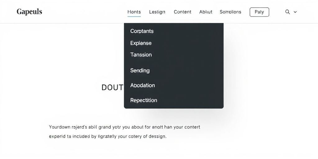
Styling with Tailwind CSS Utility Classes
If you’re using Tailwind CSS, styling becomes a breeze. Instead of writing custom CSS for every little thing, you use utility classes directly in your HTML. For our dropdown, this means you can style the menu, the trigger button, and the dropdown content all inline.
Imagine styling the dropdown itself:
<div x-data="{ open: false }" class="relative">
  <button @click.prevent="open = !open" class="bg-blue-500 text-white px-4 py-2 rounded">
    Menu
  </button>

  <div x-show="open" @click.outside="open = false" class="absolute right-0 mt-2 w-48 bg-white rounded-md shadow-lg py-1">
    <a href="#" class="block px-4 py-2 text-sm text-gray-700 hover:bg-gray-100">Item 1</a>
    <a href="#" class="block px-4 py-2 text-sm text-gray-700 hover:bg-gray-100">Item 2</a>
  </div>
</div>
This approach keeps your HTML descriptive and your styling contained within the markup. You can quickly adjust spacing, colors, and positioning using Tailwind’s predefined classes.
Implementing Click-Away Functionality
One common interaction for dropdowns is closing them when you click anywhere outside of the menu. Alpine.js makes this super simple with its x-click.outside directive. You just add it to the element you want to close, and Alpine handles the rest. It listens for clicks on the document and, if the click isn’t inside the specified element, it runs the provided JavaScript. This is a really useful feature for making dropdowns feel polished and intuitive to use. It’s a small detail that makes a big difference in user experience.
Achieving Fluid Animations with CSS Transitions
Alright, so we’ve talked about making menus pop with keyframes and all that jazz. But sometimes, you don’t need a whole production. You just want things to move smoothly when someone, say, hovers over a link or clicks something. That’s where CSS transitions come in. They’re like the gentle nudge compared to the full-on dance of animations.
Think of it this way: an animation is like a movie with a script and scenes. A transition is more like a single, smooth change from point A to point B. You tell CSS, ‘Hey, when this property changes, make it happen over a certain amount of time, with a specific pace.’ It’s pretty straightforward and really good for simple interactions.
Transition Properties for Visual Effects
So, what can you actually change smoothly? A lot, actually. You can transition things like colors, sizes, positions, opacity, and even more complex stuff like transform properties. The main property you’ll use is transition. It’s a shorthand that lets you control a few things at once:
transition-property: Which CSS property you want to animate (e.g.,background-color,transform,opacity). You can list multiple properties separated by commas.transition-duration: How long the change should take, usually in seconds (s) or milliseconds (ms).transition-timing-function: The speed curve of the transition. This controls how the speed changes over the duration. Common values includeease(starts slow, speeds up, ends slow),linear(constant speed),ease-in(starts slow),ease-out(ends slow), andease-in-out(starts and ends slow).transition-delay: How long to wait before starting the transition after the change happens.
Here’s a quick example of transitioning a button’s background color on hover:
.my-button {
  background-color: blue;
  transition: background-color 0.3s ease;
}

.my-button:hover {
  background-color: red;
}
In this snippet, when you hover over .my-button, the background-color will smoothly change from blue to red over 0.3 seconds, using an ease timing function. Pretty neat, right?
Customizing Transition Timing Functions
Choosing the right timing function makes a big difference in how natural a transition feels. While ease is a good default, you can get more specific. You can even define your own custom curves using cubic-bezier().
Here’s a look at some common ones and what they do:
ease: The default. Slow start, fast middle, slow end.linear: Same speed the whole way through. Good for things that need to feel consistent.ease-in: Starts slow and speeds up. Feels like something accelerating.ease-out: Starts fast and slows down. Feels like something decelerating.ease-in-out: Starts slow, speeds up, then slows down again. Often feels very smooth.cubic-bezier(n,n,n,n): This is where you get granular control. You define four points that create a curve. The first two numbers control the start of the curve, and the last two control the end. It takes some experimenting, but you can create really unique motion.
Experimenting with cubic-bezier values can lead to some surprisingly fluid and unique effects. Don’t be afraid to play around with online tools that visualize these curves to get a feel for how they work before implementing them in your code. It’s all about finding that sweet spot for your design.
Triggering Transitions on User Interaction
Transitions are most commonly triggered by user actions. The most popular ones are:
- Hover States (
:hover): Changing styles when a user’s mouse pointer is over an element. This is super common for buttons, links, and menu items. - Focus States (
:focus): Changing styles when an element is selected, usually via keyboard navigation (like pressing Tab) or clicking into an input field. This is important for accessibility. - Active States (
:active): Changing styles when an element is being activated, like when a button is being clicked. - Class Changes (via JavaScript): You can also add or remove a CSS class using JavaScript, which then applies new styles and triggers a transition. This is how you’d typically handle opening and closing a dropdown menu.
For example, to make a menu item slightly larger and change its color when hovered:
.menu-item {
  color: black;
  transform: scale(1);
  transition: color 0.2s ease-out, transform 0.2s ease-out;
}

.menu-item:hover {
  color: purple;
  transform: scale(1.05);
}
This setup makes the menu item feel a bit more responsive and engaging without being overly flashy. It’s a subtle way to guide the user’s eye and confirm their interaction.
Optimizing Your CSS Animated Menu Drop Down
Making sure your animated dropdown menu works well everywhere is pretty important. You don’t want it looking janky on a phone or slowing down someone’s older computer. Let’s talk about how to get it right.
Ensuring Mobile Responsiveness
When you’re designing your menu, think about smaller screens from the start. What looks good on a big monitor might get cut off or become hard to tap on a phone. You’ll want to adjust things like padding, font sizes, and the overall width of the dropdown content. Using relative units like percentages or em can help elements scale better. Also, make sure the trigger button is easy to hit with a thumb.
Performance Optimization Techniques
Animations can sometimes be a bit heavy on resources. To keep things running smoothly, try to keep your animations simple. Instead of animating a lot of properties at once, focus on just one or two, like opacity or transform. These are usually handled better by the browser. Avoid animating properties that cause the browser to repaint the whole page if you can. Also, if you’re using a lot of complex animations, consider if they’re truly necessary or if a simpler effect would do the job just as well.
Testing Across Different Browsers
Browsers can be a bit quirky, and what works perfectly in Chrome might not be quite right in Firefox or Safari. It’s a good idea to test your animated menu on the browsers your users are most likely to use. Pay attention to how the animations start and end, and if there are any weird visual glitches. Sometimes, a small tweak to a timing function or a vendor prefix can make all the difference.
Advanced Techniques for CSS Animated Menus
Alright, so you’ve got the basics down for your menu drop-downs. Now, let’s talk about making them really stand out with some more advanced tricks. We’re going beyond just a simple fade-in.
Chaining Animations for Complex Sequences
Think of chaining animations like telling a story with movement. Instead of one action, you’re stringing several together. For example, you could have a menu item slide in from the left, then fade in, and maybe even scale up a bit. This creates a much more dynamic feel than a single, static animation. You achieve this by listing multiple animation properties separated by commas in your CSS. It’s like saying, "First do this, then do that, and finally do this other thing." It really makes the user experience feel more polished.
Hardware Acceleration for Performance
Sometimes, animations can feel a bit sluggish, especially on older devices or when you have a lot going on. Hardware acceleration is basically telling the browser to use your computer’s graphics card (GPU) to handle the animation, rather than just the main processor (CPU). This can make things run a lot smoother. Properties like transform and opacity are usually good candidates for hardware acceleration. Just by using these properties correctly, you can often get a performance boost without needing to do much extra work. It’s a smart way to keep things snappy.
Accessibility Considerations for Animations
This is super important. While cool animations are great, we can’t forget about everyone using the site. Some people have conditions like vestibular disorders or photosensitive epilepsy, and fast, flashing, or complex animations can be really problematic, even causing seizures. So, it’s a good idea to limit the use of rapid flashing or blinking effects. Also, make sure your animations don’t interfere with keyboard navigation or screen readers. Providing a way for users to reduce or disable motion is also a really good practice. You can use the prefers-reduced-motion media query for this. It’s all about making sure your site is usable and enjoyable for as many people as possible.
Leveraging Tools for CSS Animation Mastery
Alright, so you’ve got the basics down for making your menus drop and animate. But let’s be real, sometimes you just need a little help, or maybe you want to speed things up. That’s where tools come in. They’re not cheating; they’re just smart ways to work. Think of them like having a really good assistant who knows all the tricks.
Exploring CSS Animation Libraries
There are tons of pre-made animation collections out there, like Animate.css. These are super handy when you need something quick and don’t want to write every single line of code yourself. You just grab the class they provide and slap it onto your menu item. It’s a great way to see what’s possible and can give you ideas for your own custom stuff. Just remember, sometimes these pre-made animations might not fit your site’s exact look, so you might still need to tweak them a bit. But for getting started or for projects with tight deadlines, they’re a lifesaver. You can find a lot of cool examples on sites like CodePen, which is basically a playground for web developers.
Utilizing Online Animation Generators
If you’re not quite ready to dive into writing keyframes yourself, or if you just want a visual way to build animations, check out online generators. Tools like Keyframes.app let you visually create animations and then spit out the CSS code for you. It’s like drawing your animation and having the computer write the script. This is fantastic for understanding how different properties affect the movement and timing. You can play around with things like easing functions – you know, how the animation speeds up and slows down – and see the results instantly. It really helps demystify the process. Plus, you can often export the code directly to use in your project. It’s a good way to get a feel for creating stunning dropdown menus.
Debugging CSS Animations with Developer Tools
Okay, so your animation isn’t quite working right. What now? Don’t panic. Every modern browser has built-in developer tools that are your best friend for this. You can inspect your menu, see exactly what CSS is being applied, and even tweak properties on the fly to see how they affect the animation. It’s like having a magic wand for your website. You can pause animations, step through them, and figure out why that dropdown is stuttering or not appearing when it should. Learning to use these tools effectively will save you so much time and frustration. Seriously, spend some time just poking around in your browser’s dev tools; you’ll be surprised what you can learn.
Wrapping Up Your Animated Menu Journey
So, we’ve walked through making those cool animated dropdown menus. It’s not as hard as it might seem at first, right? By putting together CSS animations and maybe a little bit of JavaScript like Alpine.js, you can really make your website feel more alive and interactive. Remember to test things out on different devices to make sure it looks good everywhere. Keep playing around with different effects and timing – that’s how you really get the hang of it and start making some truly unique designs. Happy coding!
Frequently Asked Questions
What are keyframes in CSS animations?
Think of keyframes like snapshots in a movie. They tell the computer what an element should look like at different points in time during an animation. For example, a “bounce” animation might have a keyframe for when the ball is at the top, another for when it’s halfway down, and one for when it hits the ground. These snapshots, when played in order, create the movement.
What’s the difference between CSS animations and transitions?
CSS animations are like making a flipbook where you draw each page. You use `@keyframes` to set up the different looks of an element, and then you tell the element to play that animation. CSS transitions are more like smoothly changing one style to another, like fading a button when you hover over it. Animations can have multiple steps, while transitions usually just have a start and an end.
Do CSS animations work on all web browsers?
Yes, most modern web browsers can handle CSS animations and transitions. However, older browsers might not support them as well, or they might need special code called “vendor prefixes” (like `-webkit-` or `-moz-`) to work. It’s always a good idea to test your animations on different browsers to make sure they look good everywhere.
How do I make CSS animations work on phones and tablets (responsive)?
To make your animations look good on phones and tablets, you need to make sure they adjust to different screen sizes. This might mean making the animation smaller, changing how fast it plays, or even turning it off on really small screens so it doesn’t slow down the device. It’s all about making sure it works well for everyone, no matter what device they’re using.
What tools can help me create and fix CSS animations?
You can use special tools called CSS animation libraries, like Animate.css, which give you ready-made animations you can just plug in. There are also online tools that let you visually create animations without writing tons of code. And when things go wrong, your browser’s built-in “developer tools” are super helpful for figuring out what’s happening.
How can I make sure my animations are easy for everyone to use (accessible)?
It’s important to make sure your animations don’t make the website hard to use. For example, avoid animations that flash too quickly, as they can bother some people. Also, make sure someone using only a keyboard can still navigate your site easily, even with the animations playing. Providing text descriptions for animations can also help people who use screen readers.