So, you’ve got a website up and running, which is awesome. But how do people actually get in touch with you? That’s where your contact page comes in. It might not be the most exciting part of your site, but a good example contact page can make a big difference. It’s like the friendly handshake of your online presence. We’ve looked at a bunch of sites to find some great contact page designs that make it easy for customers to connect. Let’s check out some inspiring examples to help you make yours stand out and maybe even bring in more business.
Key Takeaways
- A well-designed contact page makes it simple for customers to reach out, improving their overall experience with your brand.
- Providing multiple contact options, like forms, email, and phone numbers, caters to different customer preferences and urgency.
- Clear communication about response times and what happens after submission builds trust and manages expectations.
- Visual elements and a tone that matches your brand personality can make your contact page more engaging and memorable.
- An effective contact page can turn potential questions into sales, solve problems before they get big, and even open doors for new partnerships.
Harvest
Harvest really nails the contact page by keeping things super clean and straightforward. When you land on their page, you’re not bombarded with a million options. Instead, they make it easy to pick the specific product you need help with right from the start. This little step helps them route your query faster, which is pretty smart.
Their form is polished and simple, asking only for what’s necessary. Beyond the form, they don’t hide any other ways to get in touch. You’ll find their physical address, a direct support email, links to their social media, and even specific contact info for sales. Plus, they clearly state their business hours, so you know when to expect a response. They even go a step further by setting expectations about their response time, mentioning they’ll get back to you within a few hours. It’s a great example of how a contact page can be both easy to use and really effective at providing support. If you’re looking to design your own, checking out some pre-made Canva templates can give you a good starting point for a clean layout.
Adyen
Adyen, a company that handles payments, really gets how important it is to make finding help easy. Their contact page is a great example of this. Instead of just a long list of emails or phone numbers, they use clear visual tiles. Each tile is designed for a specific reason someone might need to get in touch – like if you’re a new customer needing sales help, or an existing partner looking for support. This makes it super simple for visitors to click on the right box and get to the right department without any confusion.
It’s a smart way to organize things because it cuts down on people being sent to the wrong place. Plus, it looks clean and professional. They’ve figured out how to combine being helpful with being user-friendly, which is a win-win for everyone involved, whether you’re just checking them out or you’ve been working with them for ages.
Here’s a breakdown of their approach:
- Clear Segmentation: Visual tiles guide users to specific needs (e.g., Sales, Support, Partners).
- Intuitive Design: The layout is clean and easy to understand at a glance.
- Efficiency Focused: Helps users find the right contact quickly, saving time for both parties.
Adyen’s contact page shows that thinking about the user’s journey from the start can make a big difference. It’s not just about listing contact details; it’s about anticipating needs and providing a direct path to resolution.
KeySmart
KeySmart really nails the contact page by packing a ton of useful info into a layout that feels super clean and easy to use. They give you a few ways to get in touch: you can shoot them an email, fill out a standard contact form, or pick from six common question types. This last option is pretty smart because it helps them route your query faster, meaning you get an answer quicker.
What I like most is how upfront they are. They clearly state their response time – usually one to three business days. This sets expectations right away, which is always appreciated. Plus, they don’t just cater to everyday questions. If you’re interested in wholesale orders, custom options, or their affiliate program, there are specific avenues for that too. It shows they’ve thought about different types of visitors and their needs.
To top it off, right at the bottom, they remind you of why you might want to buy from them in the first place. Things like free US shipping on orders over $45, a two-year warranty, and a secure checkout process are highlighted. It’s a nice touch that reinforces their value proposition even as you’re trying to contact them. If you’re looking for a solid key organizer, this guide can help you find the best one.
KeySmart’s approach demonstrates that a contact page doesn’t have to be an afterthought. It can be a functional hub that reinforces trust and provides clear pathways for support and business inquiries.
ban.do
Okay, let’s talk about ban.do. Their contact page is a really fun example of how a brand can inject personality into something that’s usually pretty dry. Instead of just a boring form, they’ve got this vibrant, playful vibe going on that totally fits their whole brand identity. It feels less like a chore to get in touch and more like, ‘Oh, cool, I get to interact with this brand I like!’
They do a good job of making it easy to find what you need. You’ve got options, which is always nice. They offer a few different ways to connect, so you’re not stuck with just one method if it doesn’t work for you. It’s all about making sure you can get your questions answered without a fuss.
One of the neat things they do is use clear calls to action. You know, those buttons that tell you exactly what to do next. This is super important for making sure people don’t get lost or confused. It’s a smart way to guide users, and it really helps with conversion rate optimization on their site.
They’ve managed to make a functional page feel genuinely engaging. It’s a reminder that even the practical parts of a website can be an opportunity to connect with your audience and show off what makes your brand special.
So, what can we learn from ban.do? It’s all about balancing the practical need for contact information with the brand’s unique voice. They show that you don’t have to sacrifice fun for function. It’s a great way to keep customers happy and coming back for more. Plus, it makes the whole experience of interacting with the brand feel more complete and enjoyable.
Tommy John
Tommy John really gets that sometimes you just need an answer, fast. Their contact page isn’t just a place to find a phone number; it’s more like a mini help center. They’ve combined their FAQ and contact sections, which is pretty smart. Right at the top, you’ve got a search bar. Seriously, this is a game-changer when you’re trying to find something specific without scrolling forever.
Below that, they lay out their customer service hours clearly. What’s cool is that they offer support outside of typical 9-to-5 hours, including weekends. This is a big deal for people who work during the day or just happen to have a question pop up on a Saturday. They also make it super obvious how to get in touch, giving you options like email or a phone call. No digging around required.
For returns and exchanges, they have a separate, straightforward form. This keeps things organized and makes sure your request gets to the right place without any confusion. It’s all about making it easy for you to get help, whether it’s a quick question or a more involved issue.
Having clear contact options and readily available answers shows customers you care about their experience. It builds confidence and makes them feel more comfortable doing business with you.
Here’s a quick look at what makes their approach work:
- Extended Support Hours: Available when you actually need them, not just during a standard workday.
- Multiple Contact Methods: Choose between email or phone – whatever suits you best.
- Search Functionality: Find answers instantly without sifting through pages of text.
- Organized Information: Clear categories and dedicated forms for common requests like returns.
Skims
Skims really gets that people want options when they need to get in touch. Their contact page is set up so you can pick how you want to reach out, which is pretty smart.
They offer a few different ways to connect:
- Live chat for quick questions.
- Text messaging for a more personal feel.
- Email for detailed inquiries.
What’s also great is that they give you a heads-up on when to expect a reply. They even suggest adding their help email to your contacts so their messages don’t end up lost in your spam folder. It’s these little details that make a big difference in customer service. Plus, the page is organized really well, with helpful links and FAQs on the side, making it easy to find what you’re looking for without a hassle. It’s a good example of how to make customer support feel accessible and efficient.
It’s important for businesses to remember that a contact page isn’t just a formality; it’s a direct line to your customers. Making it easy to use and informative builds trust and can even prevent potential sales from falling through the cracks because someone couldn’t get a simple question answered.
Allbirds
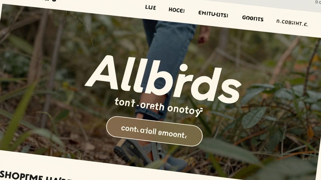
Allbirds keeps their contact page super straightforward, asking a simple question right at the top: “How Can We Help?” It’s a friendly way to start, and they immediately give you a few options to get in touch, like online chat, text, or a phone call. They also list their service hours, which is really helpful so you know when you can expect a response.
Below the contact methods, you’ll find a section with frequently asked questions, all organized by topic. This is great because it means you can often find the answer you’re looking for without even needing to contact someone directly. Plus, there’s a search bar right there, making it even easier to hunt down specific information. This approach really cuts down on friction for customers.
It’s all about making it easy for people to get the help they need, whether it’s a quick question or something more involved. Having clear contact options and a robust FAQ section means customers can choose the path that works best for them, which is a big win for customer satisfaction. If you’re looking to build trust and make your business approachable, showing off your team can be a good move, like seeing their team members.
Here’s what makes their page work well:
- Clear Availability: Listing support hours upfront sets expectations and shows transparency.
- Easy Access to Answers: A search bar and categorized FAQs let customers find solutions quickly.
- Multiple Contact Channels: Offering chat, text, and phone covers different customer preferences.
The Allbirds contact page is a good example of how to balance direct support with self-service options. It’s clean, functional, and user-focused, making it simple for anyone to get the assistance they require.
Magnolia Market
Magnolia Market at the Silos, the brainchild of Chip and Joanna Gaines, has a contact page that feels just as warm and inviting as their brand. It’s not just about finding help; it’s about connecting with the Magnolia family. They offer a few ways to get in touch, making sure you can reach them no matter what.
One of the standout features is their 24/7 chat service. This is super handy because, let’s be real, questions don’t always pop up during business hours. Whether you’re browsing late at night or early in the morning, there’s someone (or something!) ready to help. They also provide a phone number for those who prefer to talk things through, with clear hours listed so you know exactly when to call. And of course, there’s always the option to send an email.
What really makes their page work is how organized it is. They use little icons for different help categories, which is a smart move. It makes it way easier to spot what you’re looking for, whether it’s about an order, a product, or something else entirely. It’s like a friendly guide helping you find your way.
The Magnolia Market contact page is designed to be as approachable as their brand. It balances providing essential support with maintaining that personal touch that fans have come to expect.
If you’re planning a trip to Waco, it’s worth checking out Magnolia Market at the Silos to see what the buzz is all about. Their contact page reflects the same care and attention to detail you’d find throughout their entire business.
Casper
Casper, the company known for making sleep comfy, has a contact page that really gets it. They know that when you’re having a sleep-related issue, you want help fast, and you want it to be easy to find. Their approach is all about direct, accessible support.
What’s great about Casper’s contact setup is how straightforward it is. You’ve got clear headings that guide you right to what you need, whether it’s about a product you bought or one you’re thinking about. They list their customer service hours, which is super helpful for managing expectations. Plus, they give you a direct phone number, so you can actually talk to a real person – a "Sleep Specialist," no less – who can help you figure things out.
For those times when a phone call isn’t ideal, they also have a contact form. It’s a simple way to send a message and get a response without having to pick up the phone. This mix of direct calls and a form means you can reach out in a way that works best for you.
Having clear contact options isn’t just about solving problems; it’s about building trust. When a business makes it easy to get in touch, it shows they care about their customers and are ready to help. This kind of transparency can make a big difference in how people feel about a brand.
Casper’s page also highlights their commitment to customer care by offering support seven days a week. This kind of availability is a big deal, especially when you’re dealing with something as important as getting a good night’s sleep. It’s a solid example of how a company can make customer support feel less like a chore and more like a helpful resource.
Lululemon
Lululemon gets it. When you need to reach out, you don’t want to jump through a million hoops. Their contact page is pretty straightforward, offering a few different ways to get in touch. You can shoot them a text, give them a call, or hop on a live chat if you need an answer right away. They also have a pretty solid Help Center that you can search, which is great for those times you just need a quick answer without talking to anyone.
What’s really good about their setup is the variety. Not everyone likes to text, and not everyone wants to call. Giving people options like phone, chat, and text means more people are likely to get the help they need. Plus, they even mention in-store support, which is a nice touch for those who prefer face-to-face interactions.
Having a searchable Help Center is a game-changer. It means you can often find what you’re looking for without even needing to contact support directly, saving everyone time.
Here’s a quick look at their support options:
- Phone Support: For direct conversations.
- Live Chat: For quick, real-time questions.
- Text Support: An alternative for those who prefer messaging.
- Searchable Help Center: For self-service answers.
- In-Store Support: For in-person assistance.
Putting It All Together
So, we’ve looked at a bunch of cool contact page designs. Remember, your contact page isn’t just a place to stick your email address. It’s a real chance to connect with people, show them you’re a real business, and make it super easy for them to reach out. Whether it’s a simple form, a friendly message, or clear directions to different departments, the goal is to make it easy and inviting. Use these examples to get your own ideas flowing and build a contact page that works for you and your visitors.
Frequently Asked Questions
Why is a contact page important for my business?
A contact page is super important because it’s how people can easily get in touch with you. It builds trust, helps customers with questions, and can even lead to new chances for your business, like partnerships or sales.
What should I include on my contact page?
You should definitely include ways for people to contact you, like an email address, phone number, or a contact form. Adding your business address and hours can also be helpful. Making it easy to find is key!
How can I make my contact page look good and work well?
To make it great, keep the design simple and clear, just like the rest of your website. Use friendly words and make sure it’s easy to use on phones. A clear button that tells people what to do, like ‘Send Message,’ is also a good idea.
What’s the difference between a contact form and an email address?
A contact form is a special box on your website where people can type their message. It helps you get organized because you can see what the message is about right away. An email address is just a direct way to send messages to your inbox.
Should I include an FAQ section on my contact page?
Yes, an FAQ (Frequently Asked Questions) section can be really helpful! It answers common questions people might have, which saves them time and can also reduce the number of messages you get.
How quickly should I respond to messages from my contact page?
It’s good to let people know when they can expect a reply. Mentioning your response time, like ‘we’ll get back to you within 24 hours,’ helps manage expectations and shows you care about their questions.