So, you’ve got a WooCommerce store up and running, and people are actually adding things to their carts. That’s great! But what happens when they get to the checkout? If it’s a mess, they might just leave. Making your checkout page easy to use and good-looking is super important. This guide is all about how to customise WooCommerce checkout page so you don’t lose sales at the last minute. We’ll cover why it matters, what you can change, and how to do it.
Key Takeaways
- A confusing checkout page can make shoppers leave, so making it simple is key to getting more sales.
- You can change many things on your checkout page, like the fields, payment options, and how it looks, to fit your brand and customer needs.
- There are different ways to customise WooCommerce checkout page, from using built-in blocks and plugins to writing some code yourself.
- Making the checkout process faster, like with a one-page checkout or guest checkout, helps customers buy things without hassle.
- You can also use the checkout page to suggest extra products or offers, and showing security badges builds trust.
Understanding The Importance Of Checkout Page Customization
So, you’ve put in the work to get a customer to your checkout page. That’s a big win, right? Well, not so fast. This is actually the make-or-break moment. If your checkout process is clunky, confusing, or just plain annoying, people will bail. Seriously, a complicated checkout can make almost a fifth of potential buyers just walk away. They’re busy, they have options, and if it’s too much hassle, they’ll find someone else to buy from.
Enhance User Experience And Reduce Cart Abandonment
Think about it from the customer’s point of view. They’ve picked out what they want, and now they just want to pay and get on with their day. If they hit a wall of confusing forms, unexpected charges, or a design that looks like it’s from the early 2000s, they’re going to get frustrated. This frustration is a direct path to an abandoned cart. Making the checkout simple and intuitive is key to keeping them on track. It’s about removing any friction that might make them second-guess their purchase or just give up.
Boost Conversion Rates And Average Order Value
When your checkout page is smooth and easy to use, more people will actually complete their purchases. That’s the conversion rate boost right there. But it doesn’t stop there. A well-designed checkout can also be a prime spot to suggest other items. Think about adding related products or upgrades right before they hit the ‘buy’ button. If done right, this can nudge customers to spend a little more, increasing your average order value without being pushy. It’s a final chance to add value and revenue.
Align Checkout With Your Brand Identity
Your checkout page shouldn’t feel like a different website. It needs to match the look and feel of the rest of your store. Consistent branding builds trust and makes the whole shopping experience feel more professional and reliable. If your homepage is sleek and modern, but the checkout looks like a generic form, it can throw customers off. Making sure your checkout page reflects your brand identity helps create a cohesive journey from browsing to buying, reinforcing who you are as a business. This consistency is important for building a strong online presence.
The checkout page is the final hurdle. Making it as easy and pleasant as possible directly impacts whether a sale is made or lost. It’s not just about collecting payment; it’s about completing a positive customer experience.
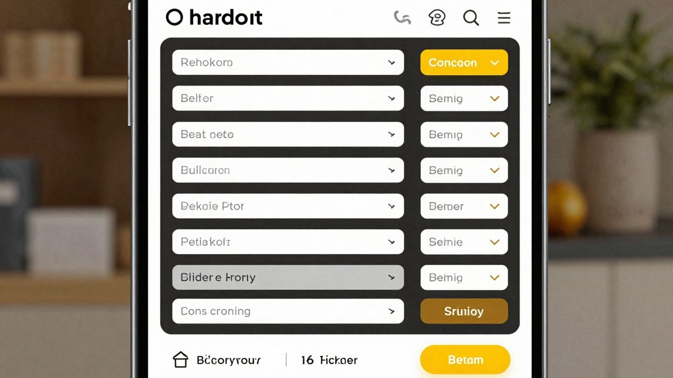
Key Areas To Customise Your WooCommerce Checkout Page
So, you’ve got people adding things to their cart, which is great! But the checkout page is where the magic either happens or falls apart. It’s not just about taking their money; it’s about making the final step as smooth and pleasant as possible. Let’s look at the main parts you can tweak to make your checkout page work harder for you.
Streamlining Checkout Fields For Efficiency
Think about all the information you really need from a customer. Do you need their company name if you’re selling handmade crafts to individuals? Probably not. Every extra field is a potential roadblock. Removing unnecessary fields, like the ‘Company Name’ if it’s not relevant, can make a big difference. You can also adjust placeholder text to be clearer, so people know exactly what to type. The goal here is speed and simplicity.
Here are some common fields you might want to review:
- First Name
- Last Name
- Company Name (Optional)
- Country
- Address Line 1
- Address Line 2 (Optional)
- City
- State/Province
- Postcode/ZIP
- Phone Number
- Email Address
Integrating Preferred Payment Gateways
People have their favorite ways to pay, and if you don’t offer them, they might just leave. Make sure you’ve got the popular options covered. This could mean adding more credit card processors, digital wallets like PayPal or Apple Pay, or even options like Buy Now, Pay Later services. The easier it is for someone to pay with their preferred method, the better.
Adding Custom Fields For Specific Information
Sometimes, the default fields just don’t cut it. Maybe you sell custom-made furniture and need to know the exact dimensions or wood type. Or perhaps you run a service and need specific booking details. Adding custom fields lets you gather this unique information directly on the checkout page, so you don’t have to follow up later.
You might need custom fields for things like gift wrapping preferences, delivery instructions, or specific product variations that aren’t standard.
Enhancing Visual Appeal And Branding
Your checkout page shouldn’t look like a completely different website. It should match the look and feel of your store. This means using your brand colors, fonts, and logo. A consistent visual experience builds trust and makes the whole process feel more professional. Think about how the buttons look, the spacing between fields, and the overall layout. It all adds up to how a customer perceives your brand.
Methods For Customising The WooCommerce Checkout Page
So, you’ve got your WooCommerce store up and running, and now it’s time to really make that checkout page work for you. It’s not just about taking orders; it’s about making the final step as smooth and pleasant as possible for your customers. Luckily, there are a few different ways you can tweak it, depending on what you’re comfortable with and what you want to achieve. You don’t need to be a coding wizard to make some pretty significant improvements.
Leveraging WooCommerce Checkout Blocks
If you’re using a modern WordPress theme, especially one built with blocks, you’re in luck. The Site Editor gives you direct access to customize your checkout page. Think of it like a digital Lego set for your website. You can simply drag and drop elements, rearrange them, and tweak settings without ever needing to look at code. Just head over to Appearance > Editor > Templates in your WordPress dashboard, find the ‘Page: Checkout’ template, and start playing around. You can toggle fields on and off, make certain ones required, and even change the text on the ‘Place Order’ button. It’s pretty straightforward stuff.
Utilizing Extensions And Plugins
For those who want more power and flexibility without diving into code, there are tons of plugins and extensions available. These tools are designed specifically to give you granular control over your checkout page. Some offer pre-designed templates you can just pick and use, while others let you build custom layouts from scratch. You can add new fields, change the flow, integrate with other services, and generally make the checkout experience fit your brand perfectly. One popular option that simplifies this process is FunnelKit Builder.
Implementing Manual Code Customizations
Now, if you’re comfortable with a bit of coding, or you have a developer on hand, you can go the manual route. This gives you the ultimate control. You can modify almost anything about the checkout page, from the layout and styling to the very logic of how it functions. However, a word of caution: if you plan to edit code directly, always, always, always use a child theme. This way, when your main theme gets an update, your custom code won’t get wiped out. It’s a bit more involved, but for specific needs, it’s the most powerful approach.
Optimizing Checkout Flow And User Experience
Making your checkout process smooth and easy is a big deal. Nobody likes a complicated checkout, right? It’s like trying to find your way through a maze when you just want to buy something. A clunky checkout can really turn people off, and they might just leave without buying anything.
Creating A One-Page Checkout Experience
A one-page checkout puts everything on a single page. All the fields for shipping, billing, payment, and order review are right there. This can make things feel faster because customers don’t have to click through multiple pages. It cuts down on clicks and can make the whole process feel more direct. Some studies show that fewer steps mean fewer people bail out before finishing.
Implementing Multi-Step Checkout Previews
On the flip side, sometimes breaking things down into steps can make the checkout feel less overwhelming. Think of it like filling out a form, but you only see a few questions at a time. Showing a progress bar or a preview of what’s coming next can help customers feel more in control. They know what to expect and can see how close they are to finishing. This is especially helpful if you have a lot of information to collect.
Enabling Guest Checkout Options
Requiring customers to create an account before they can buy something is a common reason people abandon their carts. It adds an extra step that many just don’t want to deal with. Offering a guest checkout option lets people buy without signing up. They can still choose to create an account after the purchase if they want to. This simple change can really help reduce those lost sales.
The goal here is to remove any roadblocks. If a customer is ready to buy, let them buy. Don’t make them jump through hoops. Every extra click or required piece of information is a chance for them to change their mind.
Here are some ways to make the checkout flow better:
- Inline Field Validation: Show customers if they’ve made a mistake in a field as they type, not after they hit submit. This saves them from having to re-do the whole form.
- Smart Address Defaults: If a customer’s shipping and billing addresses are the same (which they usually are), pre-fill the billing address based on the shipping address. They can always change it if needed.
- Prioritize Countries: If you sell internationally, put your most common customer countries at the top of the country dropdown list. This saves people from scrolling through a long list.
- Remember Past Entries: If a customer left the checkout and comes back, pre-fill the form with the information they already entered. It shows them they’re almost done.
Strategies To Increase Order Value At Checkout
Your checkout page is the last stop before a customer clicks ‘buy’. It’s a prime spot to nudge them towards adding a little more to their cart, without making the process a hassle. Think of it as a final, friendly suggestion rather than a hard sell.
Displaying Product Upsells And Cross-sells
This is where you can suggest items that go well with what they’ve already picked. Maybe they’re buying a camera; you could suggest a memory card or a case. Or perhaps they’re getting a dress; a matching scarf or jewelry might be a good fit. The trick is to make these suggestions relevant and easy to add. A simple checkbox next to the suggested item is often all it takes. Don’t overwhelm them with too many options; keep it focused.
- Relevance is key: Only suggest items that genuinely complement the main purchase.
- Keep it simple: Use checkboxes or quick-add buttons.
- Test placement: See if suggesting items before or after the main product details works best.
Offering Product Add-Ons And Services
Beyond just related products, think about services or extras that can improve the customer’s experience with their purchase. For example, if someone is buying a gift, offering gift wrapping or a personalized message directly on the checkout page is a great add-on. For electronics, an extended warranty or setup service could be appealing. These are often small additions that can significantly increase the total order value.
Creating Urgency With Time-Sensitive Offers
Sometimes, a little nudge of urgency can encourage a customer to complete their purchase or add an extra item. This could be a limited-time discount on a complementary product, or a special offer that expires soon. For instance, "Add this accessory now and get 10% off, offer ends in 5 minutes!" can be effective. However, use this sparingly to avoid annoying customers or making them feel pressured.
Using time-sensitive offers requires careful consideration. While it can boost immediate sales, overdoing it can lead to customer fatigue and distrust. It’s best to reserve these tactics for genuine promotions or to clear specific inventory.
Building Trust And Security On Your Checkout Page
Showcasing Security Seals And Trust Badges
When someone is about to hand over their credit card details, they want to know their information is safe. It’s a big deal! Even if your site has an SSL certificate (which it really should have by now), customers might not automatically know that. That’s where trust signals come in. Think of them as little reassurances placed strategically near your payment buttons or order summary.
What kind of badges are we talking about?
- SSL Certificate Badges: Your SSL provider might offer a badge you can display. It’s a visual cue that your site is protected.
- Accepted Payment Badges: Showing logos for Visa, Mastercard, PayPal, etc., lets customers see you accept the payment methods they prefer and trust.
- Third-Party Endorsements: If you’re part of any reputable organizations or meet certain standards (like BBB accreditation or GDPR compliance), displaying those logos can add credibility.
- Policy Badges: Reminders about your return policy or money-back guarantee can also make customers feel more secure about their purchase.
Now, some folks argue that too many badges can look cluttered or even suspicious. It’s a balancing act. The goal is to add just enough to make people feel comfortable, not overwhelm them. A clean, well-designed checkout is also a huge trust builder on its own.
The most effective trust signals are often the simplest. They should clearly communicate security and legitimacy without distracting from the main goal: completing the purchase.
Ensuring Secure Payment Processing
This is non-negotiable. You absolutely need to make sure your payment gateway is secure and reputable. Most popular WooCommerce payment gateway integrations handle this for you, but it’s worth double-checking their security features. Make sure they are PCI compliant, which means they meet strict security standards for handling cardholder data. If you’re using a less common gateway, do your homework. A data breach originating from your checkout page could be devastating for your business and your customers’ trust.
Providing Clear Return And Guarantee Policies
Customers often hesitate at checkout if they’re unsure about what happens if something goes wrong. Having clear, easily accessible information about your return policy, refunds, and any guarantees you offer can significantly reduce anxiety. Don’t just link to a separate policy page; consider adding a brief, reassuring statement directly on the checkout page, especially near the final purchase button. Something like, "Hassle-free returns within 30 days" or "Your satisfaction guaranteed" can go a long way.
Advanced Customization Techniques For WooCommerce Checkout
So, you’ve got the basics down, and your checkout page is looking pretty good. But what if you want to take things a step further? There are some really neat ways to make your checkout page even more powerful and tailored to your specific business needs. It’s not just about making it look pretty; it’s about making it work smarter for you and your customers.
Creating Product-Specific Checkout Pages
Sometimes, a one-size-fits-all approach just doesn’t cut it. Maybe you have a high-ticket item that needs a different checkout flow, or perhaps a subscription service that requires unique information. You can actually set up different checkout pages for different products or product categories. This means a customer buying a custom-made suit might see a checkout page with fields for measurements, while someone buying a t-shirt sees a standard checkout. It makes the process feel more relevant and less like a generic form.
- Identify products/categories needing unique flows.
- Use plugins or custom code to direct these products to specific checkout pages.
- Tailor fields and options to match the product’s requirements.
Integrating Email And SMS Opt-Ins
Your checkout page is one of the last chances you have to connect with a customer before they complete their purchase. It’s a prime spot to ask them if they’d like to join your mailing list or receive SMS updates. Adding a simple checkbox for opt-ins here can significantly grow your marketing list without being intrusive. Just make sure it’s clear what they’re signing up for and that it doesn’t add unnecessary steps to the checkout process. People are often more willing to sign up when they’re already in a buying mindset.
Optimizing For Mobile Responsiveness
This one is huge. More and more people are shopping on their phones, and if your checkout page looks jumbled or is hard to use on a small screen, you’re losing sales. It’s not enough for your site to just
Wrapping It Up
So, we’ve gone over why tweaking your WooCommerce checkout page is a good idea and how you can actually do it. Whether you’re adding a few fields, changing the look to match your brand, or using special tools, making these changes can really help turn more visitors into happy customers. It might seem like a small part of your online store, but getting the checkout right makes a big difference. Don’t be afraid to experiment and see what works best for your customers and your business. A smoother checkout means a better experience for everyone involved.
Frequently Asked Questions
Why should I change my WooCommerce checkout page?
Making your checkout page look and work better is super important! If it’s confusing or takes too long, people might leave without buying. By making it simple and matching your store’s style, you can help more people finish their purchases and even buy more things.
What’s the easiest way to change my checkout page?
You can use special tools called ‘plugins’ or ‘extensions’ that are made for WooCommerce. These often let you change things like adding or removing fields, changing the look, and adding payment options without needing to know how to code.
Can I make my checkout page look like the rest of my website?
Yes, definitely! Most themes let you change the colors, fonts, and layout of your checkout page to match your brand. This makes your whole store look more professional and trustworthy.
How can I get people to buy more stuff at checkout?
You can show them other cool products they might like right on the checkout page, like ‘you might also like this’ or ‘people who bought this also bought that.’ You can also offer extras like gift wrapping for a small fee.
Is it safe to change my checkout page with code?
Changing things with code can work, but it’s a bit trickier. It’s best to use a ‘child theme’ so your changes don’t get lost when you update your main theme. Always test your changes on a practice site first to make sure nothing breaks!
What is a ‘one-page checkout’?
A one-page checkout is when all the steps to buy something – like adding your address and payment info – happen on a single page. This can be faster and easier for shoppers because they don’t have to click through multiple pages.