Ever stumbled upon a website where clicking a heading reveals more text, and clicking another heading hides it? That’s the magic of an accordion web page component. They’re super handy for keeping things tidy, especially when you have a lot of information to share without making the page feel like a giant wall of text. We’re going to look at how to use these accordion web page elements effectively, making sure they’re easy for people to use and understand.
Key Takeaways
- An accordion web page component helps organize content compactly, making it easier for users to find what they need.
- Clear labels, intuitive icons, and consistent spacing are vital for a good accordion web page experience.
- Accessibility is key; use ARIA attributes and keyboard navigation for all users on your accordion web page.
- Testing your accordion web page with tools ensures it’s usable and accessible across different devices and for everyone.
- Future accordion web page designs might include more personalization and voice control options.
Understanding the Accordion Web Page Component
Definition and Purpose of Accordions
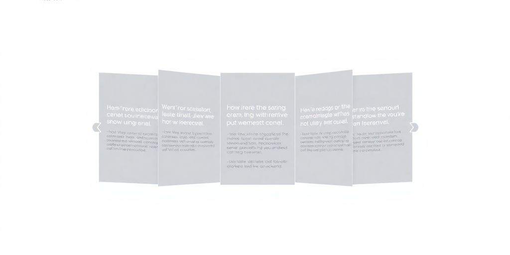
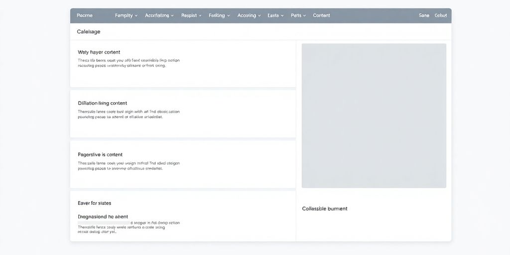
So, what exactly is an accordion on a webpage? Think of it like a set of stacked drawers or panels. Each panel has a title, and when you click on it, the content inside expands, revealing more information. The main idea here is to keep things tidy. Instead of dumping all your text onto the page at once, which can look messy and overwhelming, accordions let users choose what they want to see. This makes it much easier for people to find what they’re looking for without getting lost in a wall of text. It’s a really smart way to manage a lot of information without making the page feel cluttered. It’s all about giving users control over the content they view, which is a big part of good web design.
Evolution of Accordions in Web Design
Accordions aren’t exactly new. They’ve been around for a while, showing up in desktop applications way back when. But with the internet growing and websites becoming more complex, they really found their footing. Early on, getting them to work smoothly on a website usually meant some tricky JavaScript. Now, though, with better tools and frameworks, they’re much easier to implement and look a lot slicker. They’ve gone from being a bit of a technical challenge to a standard, useful tool in a designer’s belt. It’s pretty cool how they’ve adapted to the web’s changing landscape, especially with the rise of mobile devices where screen space is always a concern. You can see how they’ve become a go-to for organizing content efficiently on various web pages.
Importance in Modern Web Interfaces
In today’s web, where users expect information quickly and clearly, accordions are super important. They help cut down on visual noise, which is a big win. When you have a lot of content, like on an FAQ page or a product details section, accordions let you present it without making the page feel endless. This means users can scan headings and only open up the sections that are relevant to them. This focused approach can really improve how people interact with your site. It’s not just about saving space; it’s about making the user’s journey smoother and more pleasant. They’re a key part of creating interfaces that are both informative and easy to use.
Strategic Placement of Accordion Web Page Elements
When to Utilize Accordion Web Page Patterns
Accordions are fantastic for organizing information, especially when you’ve got a lot to show but want to keep things tidy. Think FAQs, product feature lists, or sections on a long landing page. They’re great for reducing visual clutter and letting users dive into what interests them without getting overwhelmed. Using accordions effectively means presenting content that can be logically grouped. For instance, if you have a series of related questions and answers, an accordion is a natural fit. It helps users scan through topics quickly. However, avoid using them for content that users need to compare side-by-side or for critical information that should always be visible. It’s all about making the user’s journey smoother, not adding extra steps.
Avoiding Common Accordion Design Pitfalls
Lots of designers trip up with accordions. A big one is unclear labeling. If your header doesn’t give a good hint about what’s inside, users will just skip it. Another common mistake is inconsistent styling or spacing between the panels. It just looks messy and unprofessional. Also, be careful not to hide too much important stuff. Sometimes, you might want to have a key section open by default, especially on mobile where screen space is limited. Remember, the goal is to make information accessible, not buried. We want users to find what they need without a struggle. It’s also worth noting that forcing users to click through too many layers can be frustrating, so keep the hierarchy relatively flat. A good rule of thumb is to keep the number of expandable sections manageable.
Distinguishing Accordions from Wizard UIs
It’s easy to mix up accordions with wizard UIs, but they serve different purposes. Accordions are for presenting static content that can be expanded or collapsed. Think of them as a way to organize a single page’s information. Wizards, on the other hand, guide users through a process or a series of steps. Each step in a wizard usually builds on the previous one, and users typically can’t skip ahead. For example, a checkout process or a software setup is a wizard. Accordions are more about exploration, while wizards are about completion. So, if your content is a collection of related but independent pieces, an accordion is likely the way to go. If it’s a linear flow, consider a wizard. Making the right choice here really impacts how users interact with your site. It’s important to understand the core function of each to implement them correctly. You can see how tabs and accordions can enhance the mobile user experience by allowing users to expand content without excessive scrolling. This approach helps organize information effectively on smaller screens. This approach helps.
Crafting User-Friendly Accordion Web Page Interactions
Clear and Concise Labeling Strategies
Think of your accordion labels as the first impression. They need to tell users exactly what they’re going to get when they click. Vague labels like ‘More Info’ or ‘Details’ just don’t cut it. Instead, aim for specificity. If a section is about ‘Shipping Costs,’ label it ‘Shipping Costs.’ If it’s about ‘Return Policy,’ use that. This clarity helps users quickly scan and find the information they need without unnecessary clicks. Good labels reduce confusion and save people time. It’s also a good idea to keep them relatively short, so they don’t wrap awkwardly on smaller screens. Remember, the goal is to make the content discoverable at a glance. For SEO purposes, placing important keywords in these visible labels can also be beneficial, making your content more accessible to search engines and users alike. You can find more on optimizing content for search engines here.
Intuitive Iconography for Expansion and Collapse
Icons are like the universal language of interfaces, and for accordions, they’re super important. You’ve got your standard plus (+) for expanding and minus (-) for collapsing, and that usually works fine. But consistency is key. Whatever icons you choose, make sure they’re used the same way across all your accordions on the page. Also, consider the visual weight of the icon; it shouldn’t overpower the text label. A subtle arrow that changes direction (pointing down when closed, up when open) is another common and effective pattern. The icon should clearly signal that an action can be taken and what the result of that action will be. Don’t make users guess!
Ensuring Consistent Spacing and Layout
When you’re building out your accordions, pay attention to the little things like spacing. Consistent padding around your labels and content sections makes the whole thing look tidy and professional. It also helps users visually separate one section from another. Think about the space between the header and the content when it’s expanded, and the space between different accordion items. A good rule of thumb is to use a consistent spacing system throughout your entire website, so your accordions feel like a natural part of the overall design. This consistency reduces cognitive load because users don’t have to re-learn how your accordions work on different pages.
Providing User Control Over Content Visibility
Ultimately, accordions are all about giving users control. They decide what they want to see and when. This means that when a user clicks to expand a section, it should stay expanded until they click to collapse it. Avoid auto-collapsing sections unless there’s a very specific reason, like opening a new section automatically closes the previous one. This behavior should be clearly indicated. Also, consider how much content is revealed. If expanding a section shows a wall of text, you might be defeating the purpose of the accordion. Break down large chunks of information into smaller, more digestible pieces within the accordion panels. This keeps the user experience positive and prevents them from feeling overwhelmed.
Enhancing Accordion Web Page Accessibility
Making sure everyone can use your accordions is a big deal. It’s not just about looking good; it’s about being usable for all your visitors, no matter their abilities. We want to avoid making things harder for people who rely on screen readers or can’t use a mouse easily.
Leveraging ARIA Attributes for Screen Readers
ARIA, or Accessible Rich Internet Applications, is like a secret language that helps assistive technologies understand your web page elements. For accordions, you’ll want to use attributes like aria-expanded to tell screen readers whether a section is open or closed. Also, aria-controls links the button that opens/closes a section to the content panel itself. This way, a screen reader user knows exactly what’s happening when they interact with your accordion. It’s all about providing clear context.
Implementing Seamless Keyboard Navigation
Not everyone uses a mouse. Many people, especially those with motor impairments, rely on their keyboard to get around. Your accordions need to be fully controllable with just the keyboard. This means users should be able to tab to the accordion headers, use the Enter or Spacebar key to open and close sections, and tab away cleanly. It should feel natural, not like a puzzle. Think about how you’d expect it to work on any other website and try to match that behavior. You can check out how Bootstrap handles this for a good example Bootstrap Accordion.
Utilizing High Contrast Colors for Visibility
Visual clarity is key. For users with low vision, good contrast between text and background, and between the accordion headers and their containers, makes a huge difference. Stick to color combinations that meet accessibility standards, like WCAG’s AA or AAA contrast ratios. This isn’t just about making text readable; it also applies to icons and any visual cues indicating whether a section is expanded or collapsed. Simple, clear visual indicators are best.
Designing Accessible Tap Targets for Mobile
When people are on their phones or tablets, their fingers are doing the tapping. Accordion headers need to be large enough and have enough space around them so that users can tap them accurately without accidentally hitting an adjacent section. Aim for tap targets that are at least 44×44 CSS pixels. This reduces frustration and makes the accordion much easier to use on smaller screens. It’s a small detail that really improves the mobile experience.
Technical Implementation of Accordion Web Pages
So, you’ve got your accordion design all planned out, but how do you actually build it? Don’t worry, it’s not as complicated as it might seem. There are a few solid ways to get this done, and they mostly boil down to using a mix of HTML, CSS, and sometimes a bit of JavaScript.
Utilizing JavaScript Libraries for Accordions
Lots of developers reach for pre-built JavaScript libraries to handle accordions. Think of libraries like jQuery UI or Bootstrap’s accordion component. These are great because they often come with ready-made functionality, like smooth animations and accessibility features already baked in. You just need to include the library in your project and then use its specific markup and JavaScript calls. It saves a ton of time, honestly. You can find examples and documentation easily online, which is super helpful when you’re just starting out or need something done quickly. Using these libraries means you don’t have to reinvent the wheel for basic accordion behavior, letting you focus more on the unique aspects of your design. It’s a good way to get a solid foundation for your interactive elements. Check out some examples of how to implement them on web page 5bfb.
Styling Accordions with CSS Best Practices
Once you have the basic structure and functionality, CSS is where you make it look good. You’ll want to use clear selectors to target your accordion headers and content panels. Keep your CSS organized, maybe using a naming convention like BEM. For the actual toggling effect, you can use CSS transitions on properties like max-height or opacity to create smooth opening and closing animations. Just make sure the max-height is set to a value larger than the content will ever be, or use height: auto; if your library supports it. Consistent padding, margins, and border styles are key to a clean look. Remember to style the active or open state of the accordion items so users know what they’re looking at. This is also where you’d add hover effects for the headers to give visual feedback.
Exploring HTML Details and Summary Tags
For simpler accordions, especially those that don’t need complex JavaScript interactions, the native HTML <details> and <summary> tags are fantastic. The <summary> tag acts as the clickable header, and the content inside the <details> tag is what gets shown or hidden. It’s pretty much an accordion out of the box, with built-in accessibility and keyboard support. You can style these elements with CSS, but the core functionality is there without any JavaScript. It’s a really clean and semantic way to build accordions, especially for things like FAQs where you just need a basic expand/collapse feature. It’s a good option to consider if you want to keep your code lean and rely on browser standards.
Here’s a quick look at the basic structure:
<details>
  <summary>Click to expand</summary>
  <p>This content will be revealed.</p>
</details>
This approach is great for reducing reliance on external scripts, which can sometimes slow down your page load times. It’s a win-win for performance and simplicity.
Testing and Optimizing Your Accordion Web Page
Accessibility Testing Tools and Techniques
Making sure your accordion works for everyone is a big deal. You don’t want anyone to get stuck. Tools like WebAIM can help you spot problems, like if the contrast between text and background is too low, or if screen readers are having trouble understanding the structure. Axe DevTools is another good one for checking against accessibility standards. It’s about catching issues before they become real headaches for users, especially those with disabilities. Think about it: if someone can’t easily tell what’s clickable or can’t navigate with their keyboard, they’re just going to leave.
Ensuring Smooth and Performant Animations
Animations can make an accordion feel really polished, but they can also slow things down if you’re not careful. Nobody likes waiting for a section to open. Aim for animations that feel natural, usually around 300 milliseconds with a gentle ease-in-out effect. This makes the transition look smooth without making users tap their fingers waiting. Libraries like Framer Motion can help you create these animations without bogging down your site’s speed. It’s a balance between looking good and working fast. You want that satisfying click and a quick reveal, not a drawn-out show.
Validating Keyboard Navigation Functionality
It’s not just about clicking with a mouse. People often use keyboards to get around websites, especially if they have trouble using a mouse. So, you need to test that your accordion can be fully controlled using just the keyboard. Can users tab to the headings? Does pressing Enter or Spacebar open and close the sections? Is there a clear visual indicator showing which section is currently selected? If you can’t easily navigate and interact with the accordion using only the keyboard, you’re missing a significant chunk of users. This is a key part of making your site accessible and usable for a wider audience. Getting this right means your accordion is more likely to be used effectively by more people, which is great for user experience and can even help with your site’s overall performance.
Future Trends in Accordion Web Page Design
The world of web design is always shifting, and accordions are no exception. We’re seeing some pretty cool developments that are making these familiar components even more useful and dynamic. It’s not just about hiding and showing content anymore; it’s about smarter ways to present information.
Progressive Disclosure Patterns
This is a big one. Progressive disclosure is all about showing users just what they need, when they need it. Accordions are a natural fit for this. Instead of overwhelming someone with a massive page, you can break it down into bite-sized chunks. Think of an FAQ page where only the question is visible until you click it, then the answer appears. This keeps the interface clean and helps users focus. It’s a way to manage complexity without making things feel hidden. We’re seeing this applied to settings menus, product details, and even long articles. It really helps with mobile usability.
Personalization with Machine Learning
Imagine an accordion that actually learns what you’re interested in. Machine learning is starting to play a role here. It can analyze user behavior and preferences to decide which accordion sections to show by default, or even reorder them. For example, on an e-commerce site, if you keep clicking on a specific product category, the accordion might automatically expand that section the next time you visit. This makes the experience feel more tailored and efficient for each individual user.
Integrating Voice UI Capabilities
With the rise of voice assistants, we’re also looking at how accordions can work with voice commands. This might mean being able to say, "Expand the shipping information" or "Collapse the payment details." It’s about making content accessible and controllable through spoken language, which could be a game-changer for users who prefer or need voice interaction. It’s still early days, but the potential for voice-controlled interfaces within accordion structures is definitely something to watch.
Wrapping Up Your Accordion Journey
So, we’ve gone through what makes a good accordion and how to avoid common pitfalls. Remember, the goal is to make things easier for the person using your website. Clear labels, simple icons, and making sure it works for everyone, including those who use keyboards or screen readers, are super important. We looked at some great examples and tools to help you get it right. Keep practicing, test your designs, and you’ll be building awesome accordions in no time. Happy designing!
Frequently Asked Questions
What exactly is an accordion on a website?
Think of an accordion like a digital filing cabinet for web pages. It lets you pack a lot of stuff into a small space by letting users click on headings to open up sections and see more details, kind of like unfolding an accordion.
When should I use an accordion design?
Accordions are great when you have lots of information that you want to keep tidy. They’re perfect for things like FAQ pages, product details, or settings menus where you don’t want to show everything all at once.
How can I create an accordion for my website?
You can build an accordion using HTML’s `details` and `summary` tags, which is super simple. You can also use JavaScript to make them work, giving you more control over how they look and behave.
How do I make sure my accordion is accessible?
Making accordions easy for everyone is key! Use clear labels so people know what they’re clicking. Make sure they work with just a keyboard and use colors that stand out. Also, use special codes called ARIA attributes so screen readers can understand them.
What are some common mistakes to avoid with accordions?
A common mistake is using confusing titles for the sections. Also, make sure the spacing and icons are the same everywhere. If you hide important info or make it hard to find, users might get frustrated.
What’s new and upcoming with accordion designs?
The future looks exciting! We’re seeing more ‘progressive disclosure,’ where content is shown bit by bit. Plus, soon accordions might get smarter with AI to show you what you need, or even work with voice commands!